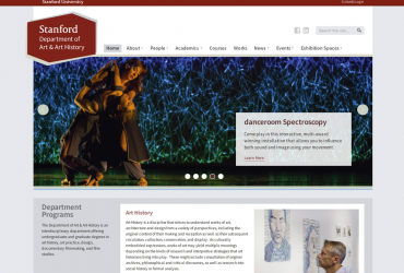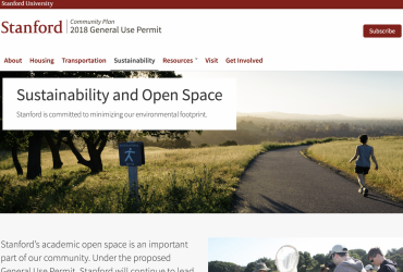
Stanford Web Services was deep in a project to consolidate University Human Resources' websites into a single-destination supersite for Stanford employees called Cardinal at Work. The site rolled up over 10 websites into one and provides "a single point to access resources to support your work, grow your career and enrich your life, ultimately enhancing your overall employee experience."
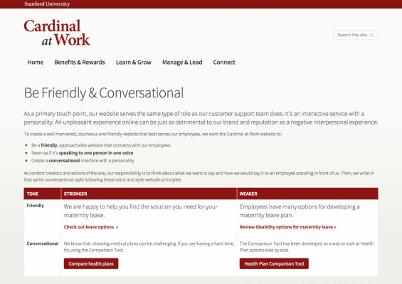
The success of this project hinged on having strong, reliable, and consistent content to build a unified experience for Stanford employees. The Cardinal at Work project lead at UHR, Kate Junco put together an extensive offline style guide to help her content creators write for the site in a cohesive way. I knew this style guide would go unused and be hard to apply to their website.
I redesigned and migrated the guide into their website's in-site help. I created side-by-side examples of how to apply her principles to improve content. For top-level editors, we assigned them permissions to be able to edit the guide as well, so that the documentation could be a living part of the website.

