Understanding the offerings and requirements of Stanford Human Resources was almost impossible. There were over 10 websites all with their own custom designs, outdated or conflicting content, and challenging editor experiences. They didn't refer to one another and had poor information architecture, which made navigating within and amongst them untenable.
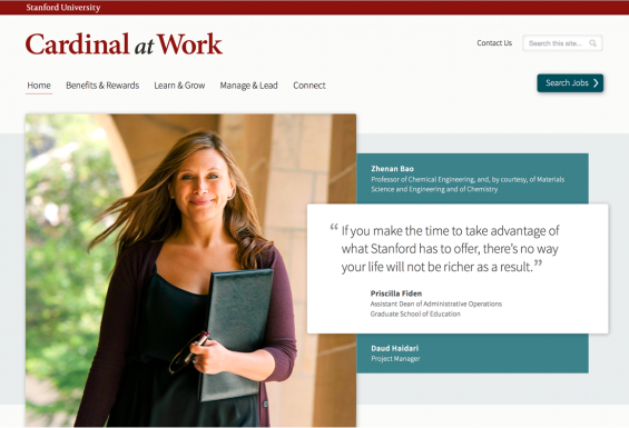
My team was brought in to help Stanford HR's communications team to combine all of these websites into a single property with deep, but meaningful navigation, content that employees could identify with, and a fresh uniform design. For over a year, I was the project lead. I was consulted during the initial project discovery conducted by an outside vendor. After discovery, I partner-designed the comps with our team's visual designer, while concurrently launching a splash website announcing the revamp that would be coming 9 months later.
During development, I conducted UX design as needed, led content strategy workshops, interfaced constantly with the clients, and was the project's scrum master. We launched on time, on budget, with happy clients, and to a positive reception.


